


Initial situation & product objective
As this was a redesign of an existing system, extensive, specific user feedback from the forum could be drawn upon. The pain points, wishes and suggestions for improvement documented there formed a reliable, data-supported basis for defining the requirements.
In addition, business and product goals were defined:
Business objectives
Increase lead generation and demand for consulting services through targeted, user-centred placement of service and sales offers within the platform.
Product objectives
Provide users with relevant information quickly and clearly and guide them to contextually appropriate services and advice without compromising the usability of the platform.

Core UX challenges
Extreme heterogeneity of user groups
Heavy users with a deep understanding of the system vs. occasional users with specific concerns.
High sensitivity to change
Increased sensitivity to change requires careful introduction of new concepts
Current design is not accessible
Accessibility did not just need to be ‘added on’, but had to be structurally embedded in the layout, components and interactions.
Limited usability on mobile devices
Low information density, visually similar pages and a lack of visual hierarchies made efficient use on mobile screens difficult.
Approach & Methodology

Understanding the problem & objectives
Clarification of business and user goals, analysis of the project context, analysis of the existing information architecture, journeys and screens, and identification of core problems

Research & Insights
Analysis of comparable forum platforms and online portals, identification of best practices and derivation of relevant design approaches for the project, evaluation of user feedback

Target groups & user journeys
Analysis of the current role concept, creation of personas, user groups and user journeys based on this, identification of individual pain points and needs

Structure & IA
Development of initial use cases and solution approaches, establishment of clear structures and user flows, creation of an improved sitemap, questioning of historically grown structures

Rough concept & wireframes
Creation of a rough strategic concept, development of initial wireframes that take into account both user requirements and UX best practices

Detailed concept & UI
Implementation of visual hierarchies and creation of final screens based on an existing design system, focus on accessibility according to WCAG, testing of initial interaction ideas

Testing & Iteration
User workshop to validate the chosen direction, validate hypotheses, continuously improve solutions based on real insights

Handover & Support
Accurate documentation, coordination with development, support during implementation, quality assurance and ongoing optimisation after launch
Key design decisions
Several strategic UX decisions were made during the project that had a significant impact on the user experience, product strategy and technical implementation. The following four decisions show the most important course settings, including their effects and conscious trade-offs.
#1: Evolution instead of radical change
Greater acceptance, lower conversion costs, less visual disruption
Less scope for ‘bold’ solutions
#2: Two-column layout logic
More content above the fold, quicker orientation, better readability, less scrolling
Higher cognitive load
#3: Consciously maintaining white space
Better readability, lower cognitive load, necessary to round off the overall concept
Conscious decision against the wishes of the heavy user group
#4: Reducing complexity (subscriptions/drafts)
Faster orientation, lower error rate, more positive first impression on new users
Frustration due to loss of familiar functions
Results & Product Impact

Improved orientation on the platform
Clearer information architecture, visual hierarchies and colour coding make it much easier to navigate through content and functions.

Accessibility systematically embedded
WCAG-compliant patterns have been structurally integrated into layouts, components and interactions.

Reduced scrolling
Two-column layouts and more compact displays reduce scroll depth, particularly on mobile screens, and improve clarity.

High acceptance among existing users
The early and continuous involvement of the community led to a high level of identification with and acceptance of the changes.

Time savings for heavy users
Customisable workflows and shortcuts noticeably speed up recurring everyday tasks.
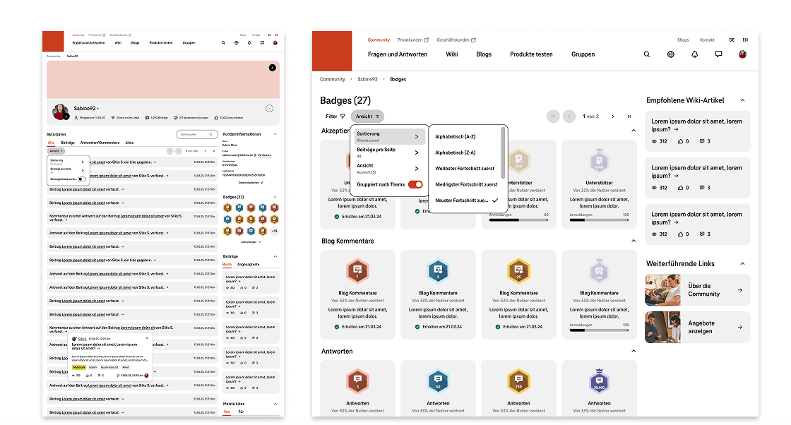
More motivating use through gamification
Revised badge mechanics strengthen engagement and participation within the community.
Key learnings
Focus through clear scope and structured feedback loops
Clear definition of scope and feedback loops prevents scope creep and ensures an efficient workflow.
Evidence instead of assumptions
Data-based user feedback and personas enable more precise requirements and more informed decisions.
Early validation through continuous user participation
Early and continuous user involvement ensures that concepts and information architecture are secured at an early stage.
Iterative improvement through continuous validation
Regular validation enables continuous optimisation of design and information architecture based on actual usage.
